If you're just starting your art journey, jumping into watercolor landscapes is one of the best decisions you can make. It’s a wonderfully rewarding experience. You're not just painting; you're learning to guide pigmented water across paper to capture the soft, atmospheric magic of nature. Think rolling hills and dreamy skies—it’s all about enjoying the process, not chasing perfection.
Why Start with Watercolor Landscapes?
So, why landscapes? What makes them the perfect subject for a watercolor beginner? It's simple: nature is beautifully imperfect.
A tree doesn't need to be perfectly straight, and a cloud doesn't have a "correct" shape. This freedom takes the pressure off. Instead of worrying about getting every line just right, you can focus on the pure joy of painting. You get to watch vibrant colors bleed into each other on wet paper, creating a hazy morning sky or the soft silhouette of distant hills. It’s truly magical.
This is where the real fun begins. It’s less about meticulous detail and more about capturing a feeling—the mood of a misty forest or the shimmer of light on water.
This guide is here to walk you through it, step-by-step. We'll focus on the essentials to build your confidence and help you create paintings you'll genuinely love.
- Working with the water: The key is to embrace the fluid, unpredictable nature of the medium, not fight it.
- Building skills from the ground up: We’ll start with simple washes and then gradually layer in more detail.
- Loving the process: The real prize is the fulfillment you get from painting itself, not just the finished piece.
My goal is to help you move past that initial hesitation and feel a true sense of artistic accomplishment. Let go of the idea of perfection. We're here to play, experiment, and create something that feels uniquely you.
And you're in good company! More and more people are discovering the joy of watercolors. In fact, the demand for student-grade watercolors is projected to grow by 6% each year, eventually making up nearly 40% of all paint sales. If you're curious, you can read more about these market insights on watercolor paints to see just how popular your new hobby is.
First things first, let's get you set up with the right tools—without breaking the bank.
Choosing Your Essential Watercolor Supplies
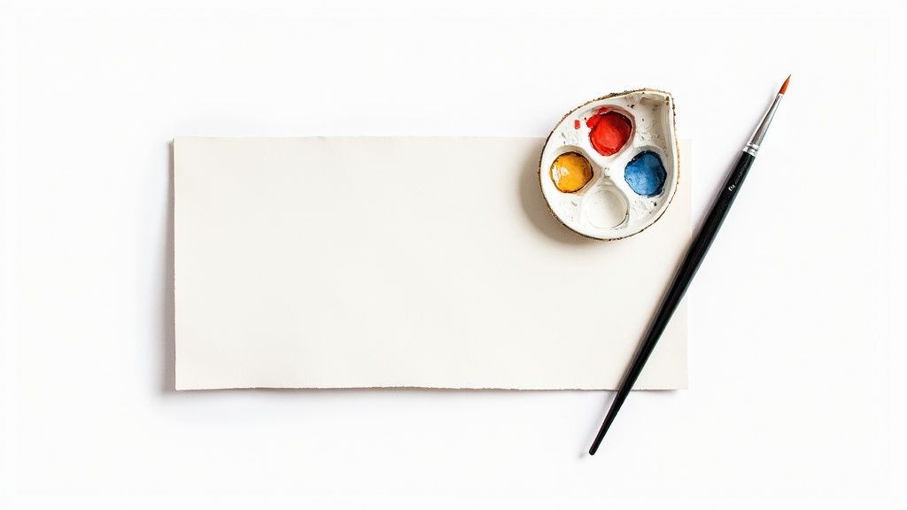
Walking into an art supply store for the first time can feel a bit like sensory overload. Rows upon rows of paints, papers, and brushes all seem to scream for your attention. But here's a secret I've learned over the years: you don't need a mountain of gear to get started with watercolor.
In fact, focusing on just a few high-quality essentials will make your learning process smoother and far more enjoyable. Let's break down exactly what you need.
The Right Paints for Your Palette
When you're looking at watercolor paints, you'll often see them labeled as "student" or "professional." The main difference boils down to pigment load—how much pure color is packed in versus how much filler or binder. Professional paints have more pigment, which means richer, more permanent colors.
But for a beginner, a good student-grade set is the perfect place to start. They're much more affordable and give you a fantastic feel for mixing and applying color without the pressure of a hefty price tag. A basic set with around 12 colors is all you need to create a surprisingly vast range of hues.
Why Your Paper Matters Most
If you're going to splurge on one thing, make it your paper. I can't stress this enough. Using the right paper is the single fastest way to improve your results, while the wrong paper will buckle, pill, and fight you every step of the way. Steer clear of your regular sketchbook paper; it simply can't handle the water.
What you're looking for is 140 lb (or 300 gsm) cold-press watercolor paper. This is the gold standard for a reason. It's thick, durable, and absorbent enough to handle several layers of paint and water without turning into a wavy, frustrating mess.
A Little Insider Advice: Cold-press paper has a wonderful texture, often called "tooth." This subtle roughness is a beginner's best friend. It helps the pigment settle into the paper's low spots, creating those beautiful, granulated effects you see in professional work. It's perfect for capturing the feel of a rocky shoreline or the rough bark of a tree.
You can buy this paper in pads, individual sheets, or my personal recommendation for beginners: a block. Blocks are glued down on all four sides, which naturally keeps your paper flat and taut as it dries. No taping required!
Selecting Your First Brushes
Just like with paints, you don't need a massive collection of brushes to create beautiful work. You can honestly paint almost anything with just three versatile brushes. Getting these core shapes will cover all your bases, from broad sky washes to tiny details.
Here’s a quick look at the essentials I'd recommend to anyone starting out.
Your Essential Beginner Watercolor Supply Kit
Supply Item | Recommended Type | Why It's Essential for Beginners |
|---|---|---|
Paints | Student-Grade Set (12 Colors) | Offers great value and performance for learning color theory and mixing without a big investment. |
Paper | 140 lb (300 gsm) Cold-Press | The heavy weight prevents buckling, and the texture helps create classic watercolor effects easily. |
Round Brush | Size 6 or 8 | Your all-purpose tool for lines, details, and small-to-medium washes. Extremely versatile. |
Flat Brush | 1-inch | Ideal for creating broad, even washes for skies or water and making sharp, clean edges. |
Wash Brush | Mop or Hake | Holds a large amount of water, making it perfect for wetting the entire paper for wet-on-wet techniques. |
With these core supplies in hand, you are genuinely ready to start painting. If you want to warm up your creative muscles before picking up a brush, checking out some beginner drawing ideas can be a great way to get your hand-eye coordination in sync. These foundational tools will serve you well long after you've completed your first painting.
Mastering Core Watercolor Techniques
The real magic of watercolor happens when you get a feel for its core techniques. I like to think of them less as rigid rules and more as a trusted toolkit. Once you get comfortable with a few key methods, you'll find the confidence to bring the images in your mind to life on paper.
Forget the dry theory for now. Let's get our brushes wet and dive into the skills you’ll be using in pretty much every landscape you paint. You're in good company, too. The popularity of watercolor is skyrocketing; in North America and Europe, over 70% of art supply stores have seen a huge jump in sales for beginner sets. If you're curious, you can see the watercolor paint market trends for yourself and realize just how many people are starting this journey with you.
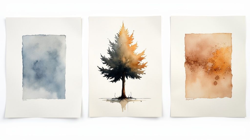
Create Soft Skies with Wet-On-Wet
This is the technique behind watercolor's signature dreamy, ethereal look. Just as it sounds, you apply wet paint to paper that’s already wet. This is what lets the colors flow, bleed, and mingle in those beautiful, often unpredictable ways.
I turn to this method constantly for soft-focus backgrounds, atmospheric skies, and those distant, hazy hills. The trick is learning to control the water—both on your brush and on the paper. Too much water turns your colors into a pale, runny mess. Too little, and they won't blend smoothly.
Try this simple exercise:
- First, take your large wash brush and apply a clean, even coat of water to a small section of your paper. You want a nice sheen, not a puddle.
- Next, load your round brush with a light blue and just touch it to the top of the wet area. Watch how it blooms across the surface.
- Clean your brush, pick up a bit of pink or yellow, and touch it near the "horizon" of your wet patch. Now, gently tilt the paper and encourage the colors to meet and blend.
This kind of drill is fantastic for building the muscle memory you need for creating stunning gradients.
Define Edges with Wet-On-Dry
Now for the complete opposite: wet-on-dry. Here, you're applying wet paint to paper that is completely dry. This gives you a crisp, clean, and totally controlled line. It's an absolute must for adding definition and structure to your landscapes.
Think about the sharp edge of a rooftop, the clear silhouette of a tree against the sky, or that crisp line where the ocean meets the sand. All of those elements demand the control you get from this technique. It’s also how you'll build up layers, adding darker details over lighter washes that have already dried.
Pro Tip: Your best friend here is patience. I can't stress this enough. You have to wait for the underlying layer of paint to be bone-dry before you add another on top. If it’s even the slightest bit damp, your new layer will bleed out and create a fuzzy edge you never intended.
Lifting and Glazing for Depth and Highlights
Two other invaluable techniques are lifting and glazing. Lifting is basically your watercolor eraser. It’s all about removing pigment from the paper. Made a small mistake? Want to create a soft highlight, like sunlight catching a cloud? Just use a clean, damp brush or a corner of a paper towel to gently "lift" the color off the page while it's still wet.
Glazing, on the other hand, is the beautiful art of building transparent layers of color. By applying a very thin wash of one color over a previously dried layer, you create incredible depth and richness. For instance, a light yellow glaze over a dried blue wash will give you a vibrant, natural-looking green that you simply can't achieve by mixing on the palette alone.
Getting comfortable with these foundational skills is everything. If you're looking for more ways to warm up your artistic muscles, these easy drawing ideas for beginners are great for some no-pressure practice.
Mixing Realistic Colors for Nature
If there's one thing that can make or break a landscape painting, it's the color. That bright, almost neon green that comes straight out of the tube might look tempting on your palette, but you’ll rarely find that exact shade out in the wild. The real secret to creating vibrant, believable watercolor landscape paintings for beginners is getting comfortable with mixing your own colors.
Here's the great part: you don't need a massive collection of paints to do this. In fact, I always tell new painters to start with a limited palette—just a handful of primary colors. It forces you to get to know your paints and discover how they interact, rather than just reaching for a pre-made color that’s almost right.
Start with a Simple Color Mixing Chart
Before you even touch a canvas meant for a full painting, I want you to create a tool that will become your best friend. A color mixing chart is your personal roadmap, a visual encyclopedia of the colors you can create with your specific paints. It’s a simple exercise, but the payoff is enormous.
Just grab a spare sheet of your watercolor paper and sketch out a small grid. Down the left side and across the top, list your primary colors—something like an Ultramarine Blue, Cadmium Yellow, and Alizarin Crimson works beautifully.
Now, the fun part begins:
- In the first row, mix your first color (say, blue) with each of the other colors across the top.
- Next, take your second color (yellow) and do the same thing in the second row.
- Keep this process going until your entire grid is filled.
You’ll be shocked at the incredible range of beautiful, earthy, and muted tones you've just created. This little chart is now your secret weapon. When you're painting and need a specific dusty green for a distant hill, you can glance at your chart and know exactly what to mix.
Mixing Natural Greens That Look Alive
One of the surest signs of a beginner's landscape is that electric, artificial-looking green. Nature is far more subtle. Real foliage is a complex dance of yellows, blues, and even hints of red or brown. The trick is to stop thinking of "green" as a single color.
Let's try creating a few greens with some real depth:
- For a Lush, Sunny Green: Start with a bright yellow and mix in a touch of Ultramarine Blue. The more yellow you use, the warmer and more sun-drenched your green will feel.
- For a Deep, Shadowy Green: This time, start with blue and add just a little yellow. To push it into a deep shadow, add a tiny speck of red (its complementary color). This instantly cuts the brightness and gives it a natural, muted quality.
- For an Earthy, Olive Green: Try mixing your yellow with a bit of black or a pre-mixed brown like Burnt Umber. This creates a wonderful, subdued green that’s perfect for dry grasses or far-off trees.
My Personal Tip: When you're mixing greens on your palette, don't stir them into a perfectly flat, uniform color. Let the blue and yellow mingle a little unevenly. When you lay that wash down on paper, those subtle variations will create a much more dynamic and natural-looking texture.
Creating Earthy Browns and Muted Grays
Just like with your greens, you can mix a whole family of rich browns and complex grays without ever needing a dedicated tube of "Payne's Gray" or "Burnt Umber." This is where your color knowledge really starts to pay off.
To get a basic brown, all you have to do is mix your three primary colors: red, yellow, and blue. By playing with the recipe, you can create a huge variety of earth tones. A bit more red and yellow gives you a warm, terra-cotta brown. Add more blue, and you'll get a cooler, darker brown that looks like damp earth.
For truly realistic grays—the kind you need for stormy skies, weathered rocks, or soft shadows—try mixing complementary colors.
- A classic, versatile gray: Mix Ultramarine Blue with its direct complement, Burnt Sienna (which is essentially an earthy orange-red).
- A warmer, softer gray: Try mixing a deep red, like Alizarin Crimson, with a muted green.
The grays you mix yourself have a life and depth that a simple black-and-white mixture just can't replicate. Once you get the hang of these simple color recipes, your watercolor landscape paintings for beginners will feel more authentic and harmonious.
Painting Your First Watercolor Landscape
Alright, this is the moment we've been working towards. We've talked about the essential supplies, practiced key brush strokes, and gotten our hands dirty mixing colors. Now, let's bring all that knowledge together and create our first of many watercolor landscape paintings for beginners.
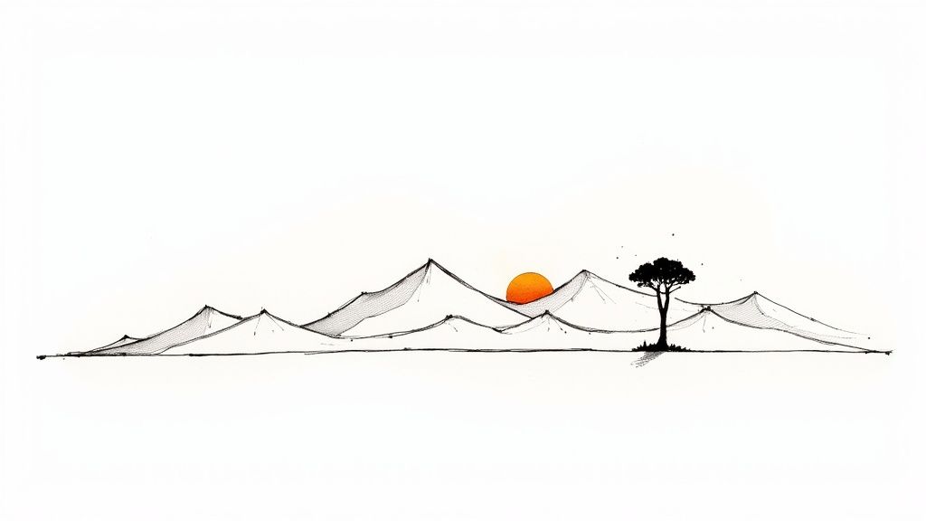
We're going to paint a simple, classic rolling hills scene. I've designed this project specifically so you can put the techniques we've covered into practice. It’s all about building your confidence. We’ll work from back to front—starting with a soft sky, then layering in the hills, and finally adding a few crisp details to bring it all to life. The goal here isn't a masterpiece; it's a finished painting you can be proud of.
Sketching Your Composition
Before a single drop of paint hits the paper, we need a simple roadmap. Grab a graphite pencil and lightly sketch out the main shapes of your landscape. Keep your touch very light! These lines are just guides, and most will disappear under the paint later.
Your sketch only needs to define three key areas:
- The Sky: Block out the top third of your paper for this.
- The Middle Ground: Draw a gentle, rolling hill just below the horizon.
- The Foreground: Add a second, slightly larger hill in front of the first one. This simple overlap is what creates that wonderful sense of depth.
Think of it as a basic blueprint for your painting. If you’re feeling a little stuck on how to arrange your hills, checking out some different landscape drawing ideas can be a great way to spark some inspiration for simple, effective layouts.
Laying Down the Sky and First Hill
Time for that wet-on-wet magic. Take your large wash brush and apply a clean, even coat of water to the entire sky area. While it's still glossy, load up your round brush with a watery mix of Ultramarine Blue. Just touch the paint to the top of the wet paper and watch it flow beautifully downwards.
While the sky is still damp, mix a light, sunny green using your Cadmium Yellow and just a touch of blue. Paint this onto the furthest hill in your middle ground, again using the wet-on-wet technique. Let the green and blue mingle a little where they meet—this creates a soft, atmospheric edge that looks fantastic.
Crucial Tip: Let this first layer dry completely. And I mean bone-dry. If you get impatient and paint over a damp layer, your colors will bleed together, and you'll lose the crisp definition between your hills. Seriously, go make a cup of tea. Patience is a painter's best friend.
This simple visual breaks down our painting process into three core stages.
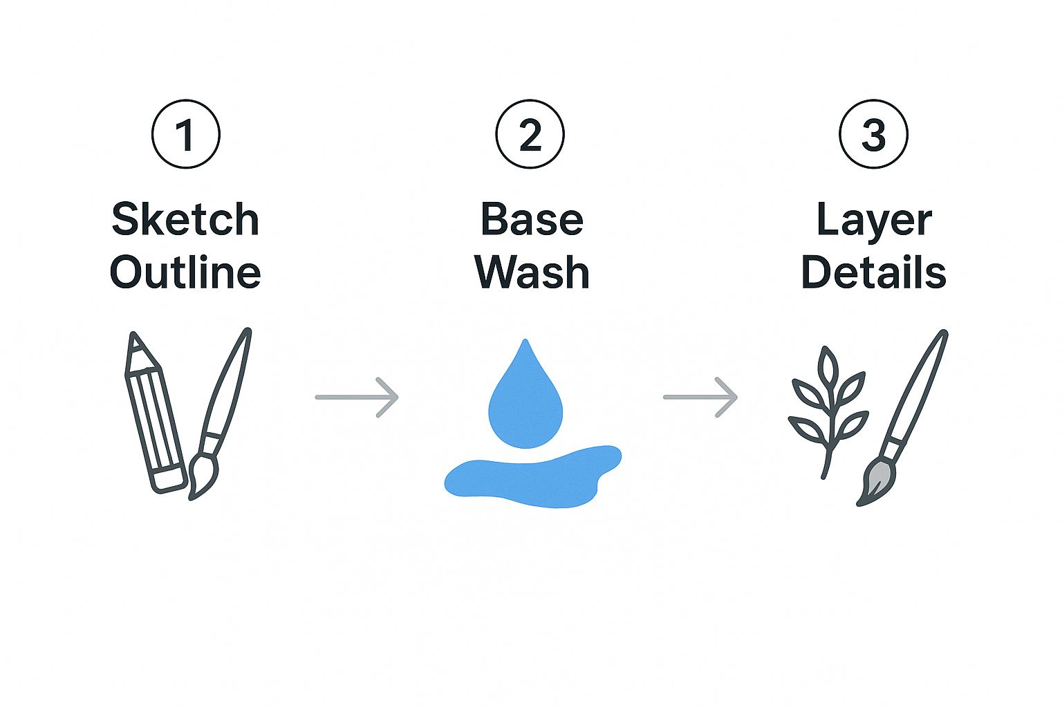
As you can see, the whole idea is to build the landscape by starting with a simple sketch, adding broad washes for our base colors, and then finishing up with layered details.
Building Layers and Adding Final Details
Once that first layer is completely dry, we can start building depth. This is where glazing comes in. Mix a green that’s a bit darker and richer than the first one. This time, you'll be using the wet-on-dry technique. Carefully paint the foreground hill, letting this new layer overlap the bottom of the hill behind it. See how that transparent color immediately creates a sense of distance?
Let this layer dry completely, too. Now for the final touches that really bring the scene to life. Mix a dark, shadowy green or even a cool brown. Using just the very tip of your round brush and the wet-on-dry method, paint a small cluster of simple trees on that middle-ground hill.
Think simple shapes here:
- A thin vertical line is all you need for a trunk.
- A few dabs and strokes will suggest the foliage.
You could also add a simple, winding path in the foreground with a light brown wash. The key is to remember that less is often more. You're just suggesting these elements, not painting every single leaf. By following these stages—from broad washes to specific details—you've just created a charming and complete landscape painting. Well done
You've Got Questions? We've Got Answers
Every artist, and I mean every artist, hits a few snags when they first start with watercolors. It's just part of the process! Instead of letting these little frustrations derail your creative flow, let's get them sorted out.
Here are a few of the most common hurdles I see beginners face, along with some practical advice I've picked up over the years.
"Help! My Paper Is Turning into a Wavy Mess!"
Ah, the dreaded paper buckle. This happens when the water you're using makes the paper fibers swell up and then dry unevenly. It’s a classic watercolor problem, but thankfully, the fix is pretty straightforward.
The best defense is a good offense: start with the right paper. I always recommend beginners use a paper that is at least 140 lb (300 gsm). This heavier weight is specifically made to take a beating from water without warping as much.
Another pro-level trick is to tape your paper down. Use artist's tape to secure all four edges to a firm surface (a drawing board or even a sturdy piece of cardboard works). This forces the paper to dry flat. Just be patient and let your masterpiece dry completely before you gently peel the tape away.
"Why Do My Colors Look So... Muddy?"
This is probably the single most common frustration for new watercolorists. You imagine vibrant, glowing colors, but what ends up on the paper looks more like dishwater. Don't worry, this is usually caused by one of two things: over-mixing on the palette or overworking the paint on the paper.
Here’s how to keep your colors clean and bright:
- Be decisive. Lay down your brushstroke with confidence and then leave it alone. The more you fuss with it, the more you risk muddying the color.
- Let it dry! Patience is a virtue in watercolor. Always let one layer of paint dry completely before you add another one on top. This is a core technique called glazing, and it’s key to luminous color.
My number one tip for avoiding mud? Simplify your palette. When you're starting out, try sticking to just three to five colors. This makes it almost impossible to accidentally mix clashing complementary colors (like red and green, or purple and yellow) which are the main culprits behind those dull, brownish tones.
"Is There an Undo Button? How Do I Fix a Mistake?"
Watercolor has a reputation for being unforgiving, but you have more options than you think. While you can't just paint over a mistake like you can with acrylics, you can often perform a little rescue mission.
If the paint is still wet, you can "lift" the color right off. Just take a clean, damp brush (I call it a "thirsty" brush) and touch it to the spot. The brush will wick the pigment away. A corner of a paper towel can do the trick, too.
For mistakes on dry paint, you can gently re-wet the area with a clean brush and then blot it carefully with a paper towel to lighten it. Keep in mind that some colors stain the paper more aggressively than others. But honestly, sometimes the best solution is to just lean into the "mistake." Those little imperfections often give a watercolor painting its unique charm and character.
Ready for your next artistic adventure? If you're looking for fresh inspiration, the Drawing List has a Drawing Ideas Generator with thousands of prompts to get your creative gears turning.